RotaryKnob
Rotary Knob
A lightweight Rotating Knob for Android


Table of Contents
- Purpose
- Features
- Demo
- Prerequisites
- Dependency
- Usage
- Customization
- Attributes
- Notes
- Contribute
- License
Purpose
Rotary Knob is a handy Android library crafted in Kotlin. It fills the gap where Android lacks a volume knob view. Existing solutions are often outdated and incomplete. Rotary Knob steps in to provide a simple, customizable, and well-maintained volume knob for Android developers. It’s your go-to solution for adding intuitive volume controls to your apps, enhancing user experience effortlessly.
Features
- Lightweight
- Highly customizable
- Supports both Kotlin and Java
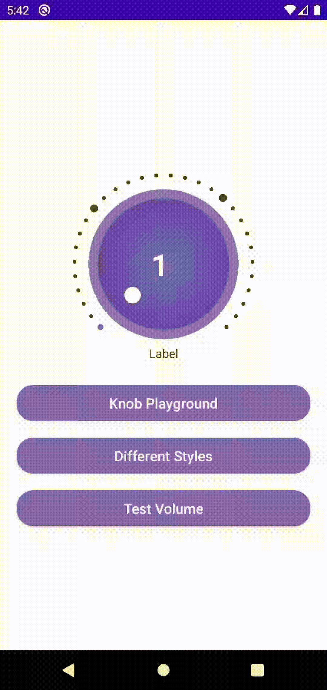
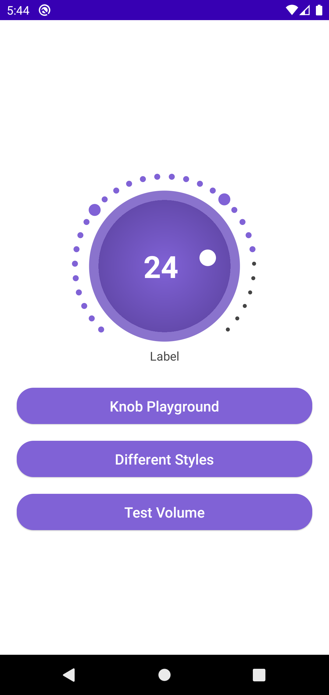
Demo
| Description | Demo |
|---|---|
| Animated Demo of How the Knob Works. You can Test various functions of this knob by downloading the demo apk. I’ve made a custom Knob Playground to test with the customizations - Download |
 |
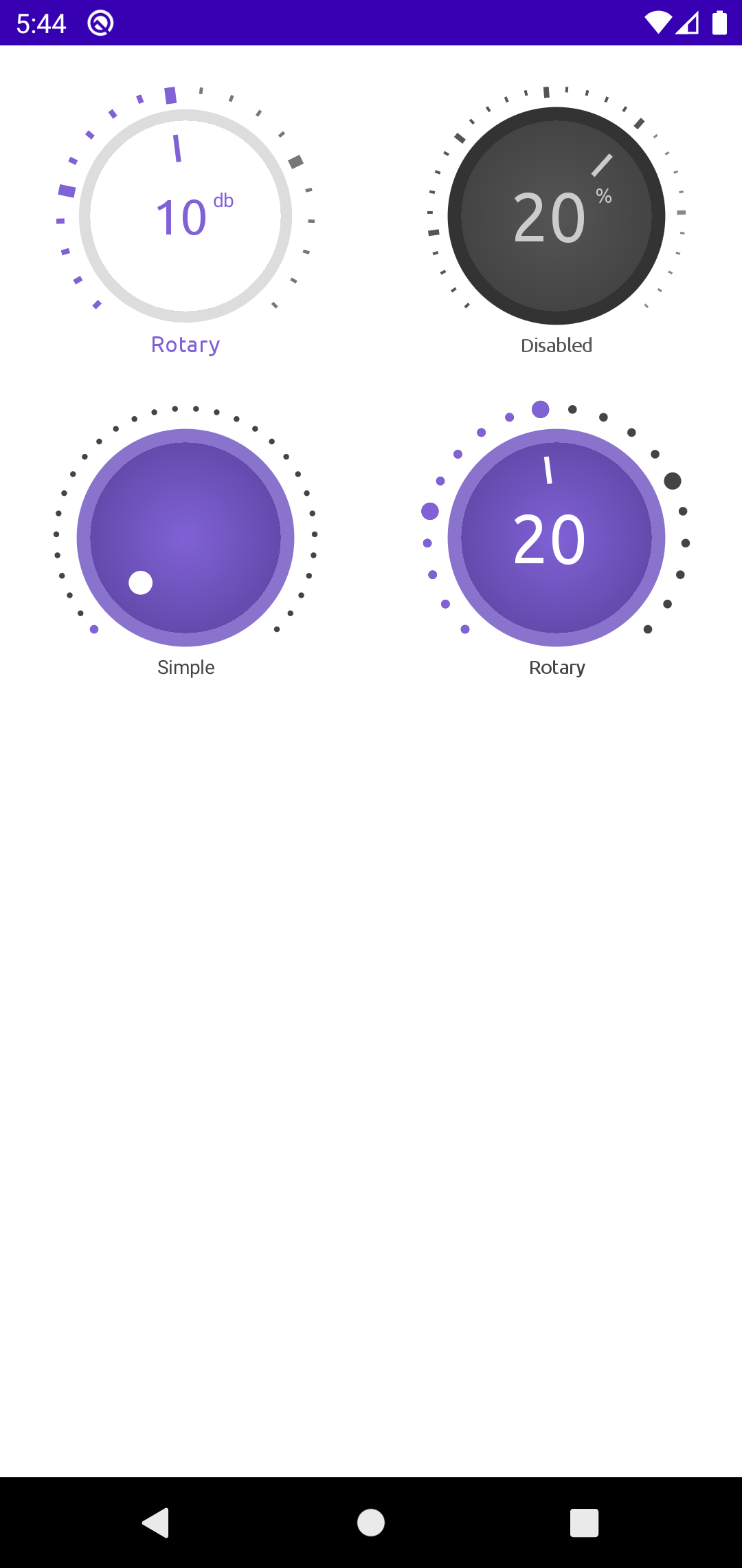
Shots Showing Styles and Customizations
| Shots | Shots | Shots |
|---|---|---|
 |
 |
 |
 |
 |
 |
Prerequisites
Kotlin DSL
dependencyResolutionManagement {
    repositoriesMode.set(RepositoriesMode.FAIL_ON_PROJECT_REPOS)
    repositories {
        google()
        mavenCentral()
        maven{
            url = uri("https://jitpack.io")
        }
    }
}
dependencyResolutionManagement {
		repositoriesMode.set(RepositoriesMode.FAIL_ON_PROJECT_REPOS)
		repositories {
			mavenCentral()
			maven { url 'https://jitpack.io' }
		}
	}
Dependency
Add this to your module’s build.gradle.kts file (latest version ):
dependencies {
    ...
    implementation("com.github.ahmmedrejowan:RotaryKnob:0.1")
}
dependencies {
    ...
    implementation 'com.github.ahmmedrejowan:RotaryKnob:0.1'
}
Usage
XML
    <com.rejowan.rotaryknob.RotaryKnob
        android:id="@+id/rotaryKnob"
        android:layout_width="match_parent"
        android:layout_height="250dp"
        android:layout_marginTop="20dp" />
Kotlin
        binding.rotaryKnob.knobEnableListener = object : RotaryKnob.OnKnobEnableListener {
            override fun onKnobEnableChanged(isEnable: Boolean, progress: Int) {

            }
        }

        binding.rotaryKnob.progressChangeListener = object : RotaryKnob.OnProgressChangeListener {
            override fun onProgressChanged(progress: Int) {

            }
        }
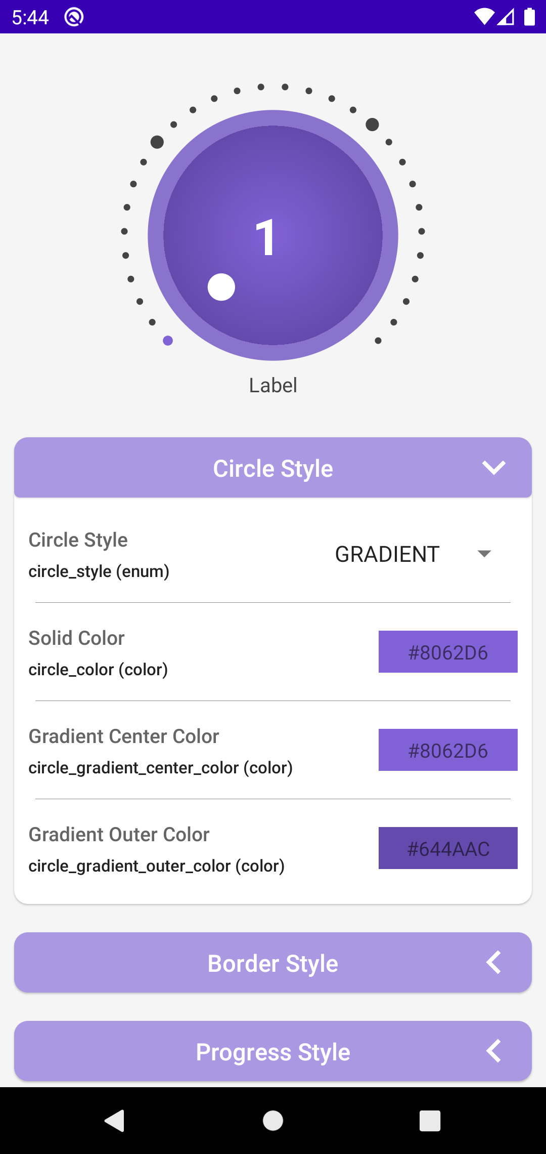
Customization
XML
<com.rejowan.rotaryknob.RotaryKnob
    android:id="@+id/rotaryKnob2"
    android:layout_width="0dp"
    android:layout_height="wrap_content"
    android:layout_gravity="center"
    android:layout_weight="1"
    app:big_progress_diff="5"
    app:big_progress_multiplier="3"
    app:border_color="#dddddd"
    app:border_width="6dp"
    app:circle_color="#ffffff"
    app:circle_style="solid"
    app:current_progress="10"
    app:double_touch_to_enable="true"
    app:indicator_color="#8062D6"
    app:indicator_style="line"
    app:label_text="Rotary"
    app:label_text_color="#8062D6"
    app:label_text_font="@font/ubuntu_normal"
    app:label_text_size="12sp"
    app:max="20"
    app:min="0"
    app:progress_color="#777777"
    app:progress_filled_color="#8062D6"
    app:progress_filled_multiplier="1.3"
    app:progress_style="line"
    app:progress_text_color="#8062D6"
    app:progress_text_font="@font/ubuntu_normal"
    app:progress_text_size="26sp"
    app:progress_text_style="bold"
    app:show_big_progress="true"
    app:show_border="true"
    app:show_label="true"
    app:show_progress_text="true"
    app:show_suffix_text="true"
    app:suffix_text="db"
    app:suffix_text_color="#8062D6"
    app:suffix_text_size="10sp"
    app:suffix_text_style="normal"
    app:touch_to_enable="false"
    />
All of this can be set programmatically using Kotlin or Java as well.
Kotlin
        // listener for knob enable/disable
        binding.rotaryKnob.knobEnableListener = object : RotaryKnob.OnKnobEnableListener {
            override fun onKnobEnableChanged(isEnable: Boolean, progress: Int) {

            }
        }

        // listener for knob progress change
        binding.rotaryKnob.progressChangeListener = object : RotaryKnob.OnProgressChangeListener {
            override fun onProgressChanged(progress: Int) {

            }
        }

        // set knob min, max and current progress
        binding.rotaryKnob.currentProgress = 50
        binding.rotaryKnob.min = 0
        binding.rotaryKnob.max = 100
Attribute
Full list of attributes available
| Attribute | Format | Description | Example |
|---|---|---|---|
circle_style |
enum | Style of the circle (solid or gradient) |
circle_style="solid" |
circle_color |
color | Color of the circle | circle_color="#FF0000" |
circle_gradient_center_color |
color | Center color of the circle gradient | circle_gradient_center_color="#FF0000" |
circle_gradient_outer_color |
color | Outer color of the circle gradient | circle_gradient_outer_color="#00FF00" |
show_border |
boolean | Indicates whether to show border | show_border="true" |
border_color |
color | Color of the border | border_color="#000000" |
border_width |
dimension | Width of the border | border_width="2dp" |
progress_style |
enum | Style of the progress (circle or line) |
progress_style="circle" |
progress_color |
color | Color of the progress | progress_color="#00FF00" |
show_big_progress |
boolean | Indicates whether to show big progress | show_big_progress="true" |
big_progress_multiplier |
float | Multiplier for big progress | big_progress_multiplier="1.5" |
big_progress_diff |
integer | Difference for big progress | big_progress_diff="20" |
progress_filled_color |
color | Color of filled progress | progress_filled_color="#FF0000" |
progress_filled_multiplier |
float | Multiplier for filled progress | progress_filled_multiplier="0.8" |
indicator_style |
enum | Style of the indicator (circle or line) |
indicator_style="circle" |
indicator_color |
color | Color of the indicator | indicator_color="#0000FF" |
indicator_size |
dimension | Size of the indicator | indicator_size="8dp" |
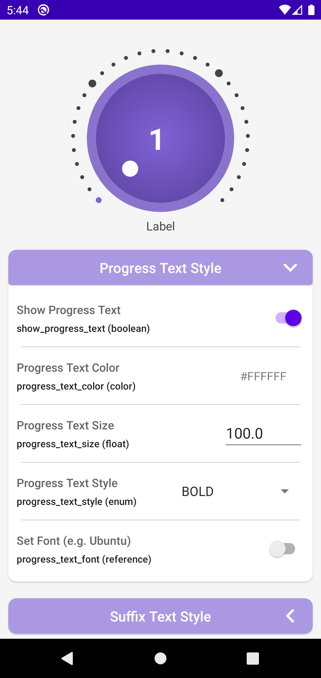
show_progress_text |
boolean | Indicates whether to show progress text | show_progress_text="true" |
progress_text |
string | Text for progress | progress_text="Volume" |
progress_text_color |
color | Color of progress text | progress_text_color="#000000" |
progress_text_size |
dimension | Size of progress text | progress_text_size="14sp" |
progress_text_style |
enum | Style of progress text (normal, bold, italic, bold_italic) |
progress_text_style="bold" |
progress_text_font |
reference | Font for progress text | progress_text_font="@font/my_font" |
show_suffix_text |
boolean | Indicates whether to show suffix text | show_suffix_text="true" |
suffix_text |
string | Text for suffix | suffix_text="dB" |
suffix_text_color |
color | Color of suffix text | suffix_text_color="#00FF00" |
suffix_text_size |
dimension | Size of suffix text | suffix_text_size="12sp" |
suffix_text_style |
enum | Style of suffix text (normal, bold, italic, bold_italic) |
suffix_text_style="italic" |
suffix_text_font |
reference | Font for suffix text | suffix_text_font="@font/my_font" |
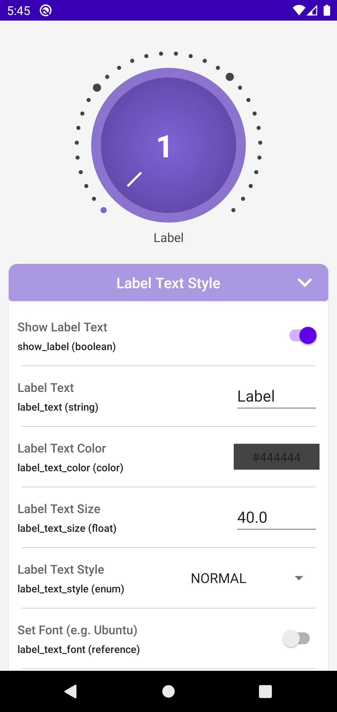
show_label |
boolean | Indicates whether to show label | show_label="true" |
label_text |
string | Text for label | label_text="Volume" |
label_text_color |
color | Color of label text | label_text_color="#000000" |
label_text_size |
dimension | Size of label text | label_text_size="16sp" |
label_text_style |
enum | Style of label text (normal, bold, italic, bold_italic) |
label_text_style="bold" |
label_text_font |
reference | Font for label text | label_text_font="@font/my_font" |
label_margin |
dimension | Margin for label | label_margin="8dp" |
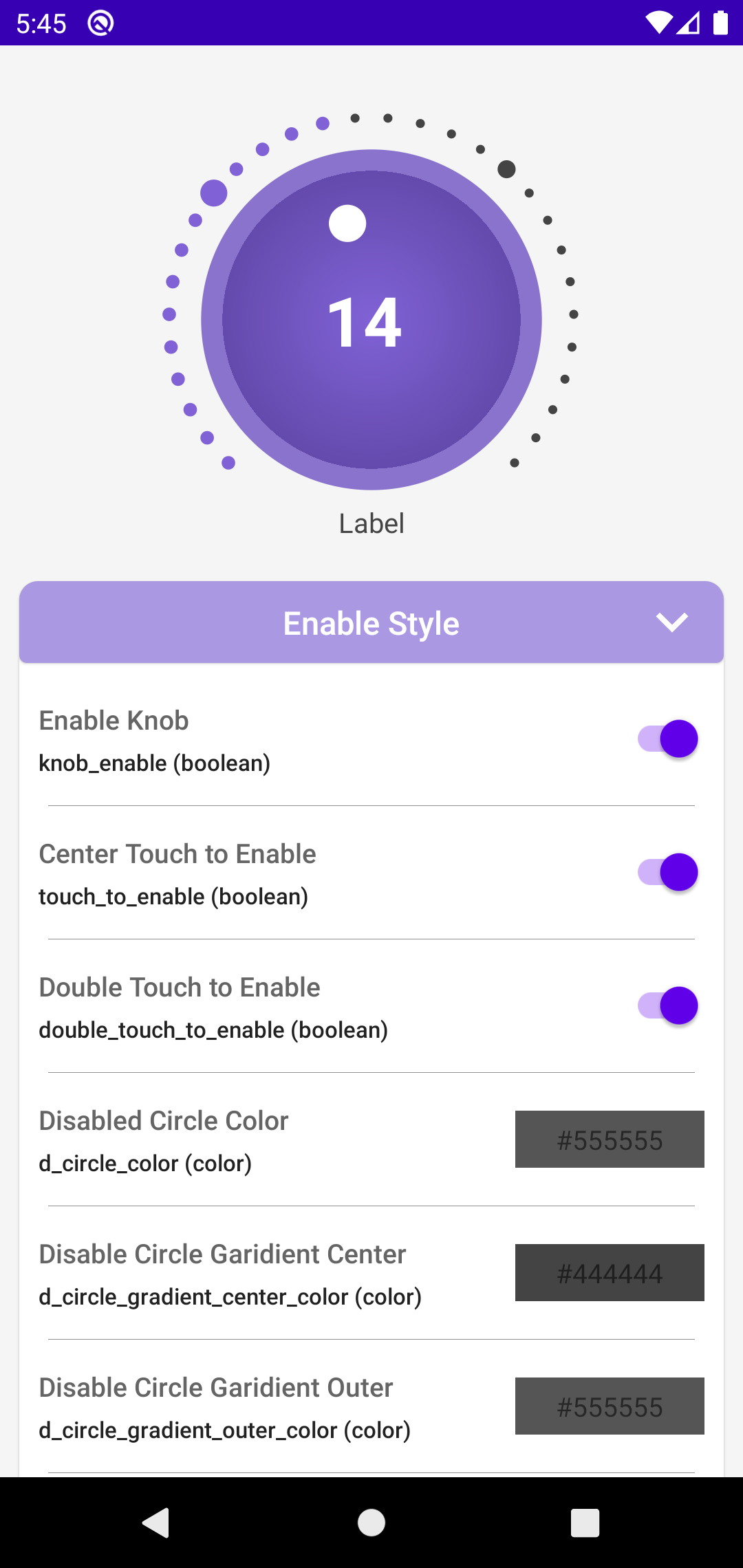
knob_enable |
boolean | Indicates whether knob is enabled | knob_enable="true" |
touch_to_enable |
boolean | Indicates whether touch enables knob | touch_to_enable="true" |
double_touch_to_enable |
boolean | Indicates whether double touch enables knob | double_touch_to_enable="true" |
d_circle_color |
color | Default color of the circle | d_circle_color="#FFFFFF" |
d_circle_gradient_center_color |
color | Default center color of the circle gradient | d_circle_gradient_center_color="#FFFFFF" |
d_circle_gradient_outer_color |
color | Default outer color of the circle gradient | d_circle_gradient_outer_color="#CCCCCC" |
d_border_color |
color | Default color of the border | d_border_color="#000000" |
d_progress_color |
color | Default color of the progress | d_progress_color="#00FF00" |
d_big_progress_color |
color | Default color of the big progress | d_big_progress_color="#FF0000" |
d_progress_filled_color |
color | Default color of filled progress | d_progress_filled_color="#FF0000" |
d_indicator_color |
color | Default color of the indicator | d_indicator_color="#0000FF" |
d_progress_text_color |
color | Default color of progress text | d_progress_text_color="#000000" |
d_suffix_text_color |
color | Default color of suffix text | d_suffix_text_color="#00FF00" |
d_label_text_color |
color | Default color of label text | d_label_text_color="#000000" |
min |
integer | Minimum value | min="0" |
max |
integer | Maximum value | max="100" |
current_progress |
integer | Current progress value | current_progress="50" |
Notes
- The library is in its early stages, so there may be some bugs.
- If you find any bugs, please report them in the
Issuestab. - Sample app is available in the app directory.
- It doesn’t Support Floating Numbers for Value.
Inspiration and Credit
- Inspired by Knob by CoDevBlocks
- Inspired by Knob by BeppiMenozzi
- Inspired by kotlin-rotary-knob by o4oren
- Color Picker Inspired by ColorPicker by Dhaval2404
Contribute
Please fork this repository and contribute back using pull requests.
Any contributions, large or small, major features, bug fixes, are welcomed and appreciated.
Let me know which features you want in the future in Request Feature tab.
If this project helps you a little bit, then give a to Star ⭐ the Repo.
License
Copyright 2024 ahmmedrejowan

Licensed under the Apache License, Version 2.0 (the "License");
you may not use this file except in compliance with the License.
You may obtain a copy of the License at

 http://www.apache.org/licenses/LICENSE-2.0

Unless required by applicable law or agreed to in writing, software
distributed under the License is distributed on an "AS IS" BASIS,
WITHOUT WARRANTIES OR CONDITIONS OF ANY KIND, either express or implied.
See the License for the specific language governing permissions and
limitations under the License.